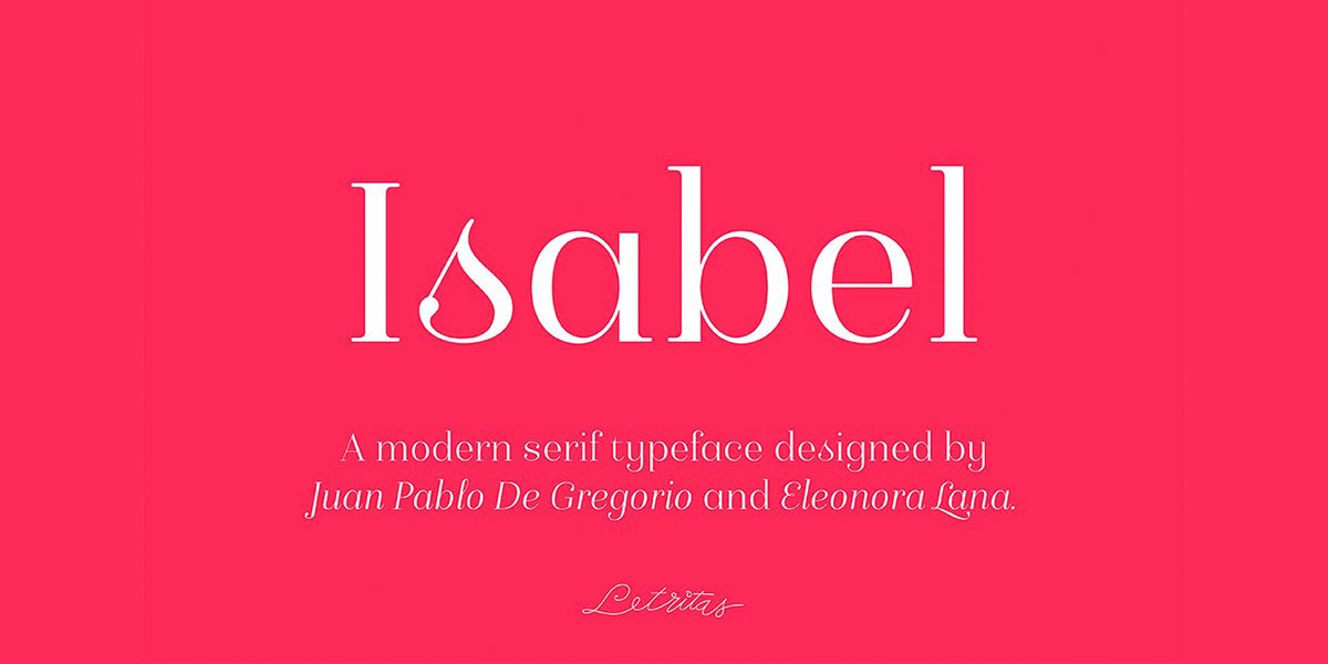
Isabel was made out of necessity to create a new font for children and teenagers. It could be enough friendly and versatile for text in words or even easy-to-read long texts.
The purpose of Isabel is to combine all the lovely and friendly features of the simple letters. The teachers teach the pupils at primary school. They start to learn to read, together with the standard editorial fonts we read every day. In this way, it generates a very joyful serif font, or even friendly font, with some conservative aspects. In other words, Isabel is a font with a “classic features” typography. It is proud to show its innocent and ingenuous elements, this gives the font a new point of view.
The family is composed of 3 parts: the regular version, the italic version, and the unicase version.
Each of them has 5 weights, 551 characters, and is composed of 208 languages.
Unlock the creative potential of your presentations and videos with hand-drawn motion graphics! Explore how…
Discover Google AI Studio, an innovative platform transforming graphic design with artificial intelligence. Tailored for…
Well, friend, it might be time for a little visual glow-up and a sprinkle of…
Whether you're a seasoned professional or just starting your creative journey, having a versatile library…
Boost Sales with Handwritten Fonts: Your Guide to Human-Centric Graphic Design - That's the magic…
The Complete Presentation and Public Speaking/Speech Course" on Udemy – the presentation skills training and…