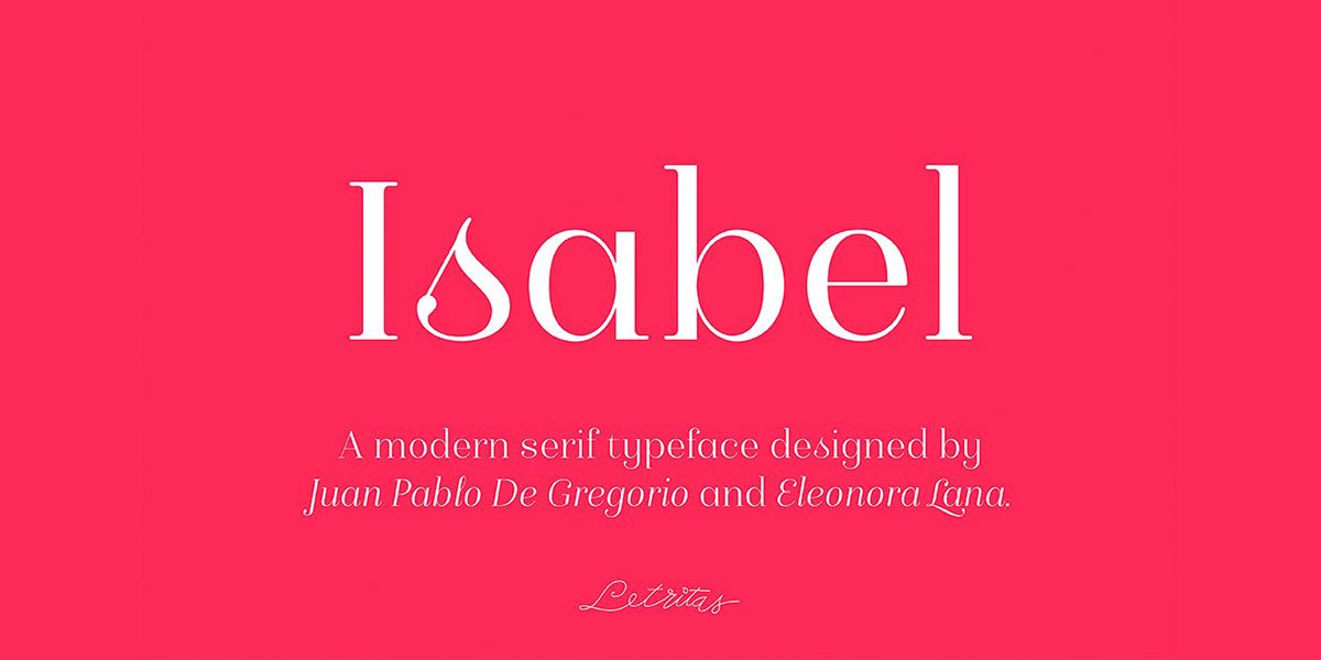
Isabel was made out of necessity to create a new font for children and teenagers. It could be enough friendly and versatile for text in words or even easy-to-read long texts.
The purpose of Isabel is to combine all the lovely and friendly features of the simple letters. The teachers teach the pupils at primary school. They start to learn to read, together with the standard editorial fonts we read every day. In this way, it generates a very joyful serif font, or even friendly font, with some conservative aspects. In other words, Isabel is a font with a “classic features” typography. It is proud to show its innocent and ingenuous elements, this gives the font a new point of view.
The family is composed of 3 parts: the regular version, the italic version, and the unicase version.
Each of them has 5 weights, 551 characters, and is composed of 208 languages.
The best Clip Studio Paint courses on Udemy in 2026, compared by skill level so…
AI changed what entry-level design work looks like, but it didn't remove the need for…
AI changed what entry-level design work looks like, but it didn't remove the need for…
Your pen pressure feels off, lines lag behind your hand, or the tablet barely registers…
Photoshop is a photo editor, not a drawing tool. Krita is free but complex. Procreate…
Hiring voice actors costs hundreds per session. Yet robotic text-to-speech kills the mood instantly. In…